
My Approach
Research
My research involved viewing the shop’s inventory to determine the site’s information architecture, evaluating other e-commerce sites to understand best practices, and conducting user interviews to identify potential users.
Design
After gaining an understanding of the user and his or her expectations from an e-commerce site, I determined the necessary features to include on the site. From there, I built a wireframe prototype to test the user flow.
Testing
Once my prototype was ready, I conducted user tests to identify areas for improvement in the shopping process. With the insights provided by these tests, I was able to iterate and refine my design, creating a polished final product that performs the basic functions of the e-commerce experience.
Research
I first researched the shop to understand its product and customers. I then conducted user interviews to better understand what customers were looking for in the online shopping experience. To provide a framework for e-commerce processes, I researched the shop's competitors and other retail sites.
Information Architecture
I determined the site's information architecture by viewing the shop's inventory on its Pinterest page, examining the organization methods in the shop, and researching competitors' IA terminology. From there, I created six categories, with a maximum of four sub-categories within them. To confirm that my categories and sub-categories were logical, I conducted card sorts.
When I visited the museum shop to see how items were organized, I found that similar items, such as books, children’s toys and games, and kitchen items, were placed together. However, there were two other categories that were featured on display tables. They included a temporary exhibit display, which took up three tables throughout the store, and a local artist/local product section. Knowing that the shop emphasized these two areas, I considered adding them to my categories list and looked to my interviews to confirm the need for them in the online store.
User Interviews and Personas

For my user interviews, I focused on understanding the customer. I first spoke with clerks at the museum shop to identify the typical shopper demographics.
I learned that most of the repeat customers are University of Texas staff and that the most common demographic of shoppers is middle-aged women. After gathering this information, I was able to focus on finding users who fit this demographic.
Insights from User Interviews
- Visiting habits - Most people visit museum shops to browse for gifts and unique items.
- Shop organization - Because shoppers look for unique items, they often shop by exhibit or for local items. My interviews confirmed the value in giving these items their own sections on the site.
- Advertising in publications - Some users search for items they see featured in newspapers and magazines.
- Discounts and promotions - Shoppers are more attracted to an e-commerce site when there is a sale or they have a discount code.
Personas
Based on my interviews, I created two personas that helped to direct the design of my site.

Primary Persona: The Cultured Local
My primary persona is in her mid-fifties and is a local university professor. She shops for unique gifts and special-occasion items at museum shops about once every two months. She sometimes visits museum websites when she sees their items featured in newspapers and magazines. Generally, she tends to shop online when she receives a promotional email advertising a sale.

Secondary Persona: The Art Enthusiast
My secondary persona is in her late twenties and studied Art History in college. She visits museums multiple times per month to see the exhibits and is a member at her favorite local museum. She likes to support local artists and to browse items related to the exhibits at museum shops. She works in Public Relations and follows her favorite museums on social media.
Competitive Analysis
I looked at a number of museum shop sites and large online retailers to understand which features are fundamental to the online shopping experience. The museum shops included MoMA, which has a large selection of products and is a larger operation than the Blanton, and Chihuly Garden and Glass, which is a more specialized museum that displays the works of only one artist. My intent with the Blanton’s site was to be somewhere in the middle between MoMA and Chihuly in terms of features and inventory. The large online retailer I focused on was Zappos. I used the Zappos site to see how good e-commerce is executed.
Through my comparison, I identified features that are fundamental to e-commerce sites, such as including featured items and displaying multiple product photos. These features would need to be present on my site as well. I also narrowed down the features list by acknowledging that some features, such as product videos, are for more advanced retail and larger inventories. I decided to eliminate such features from my list.
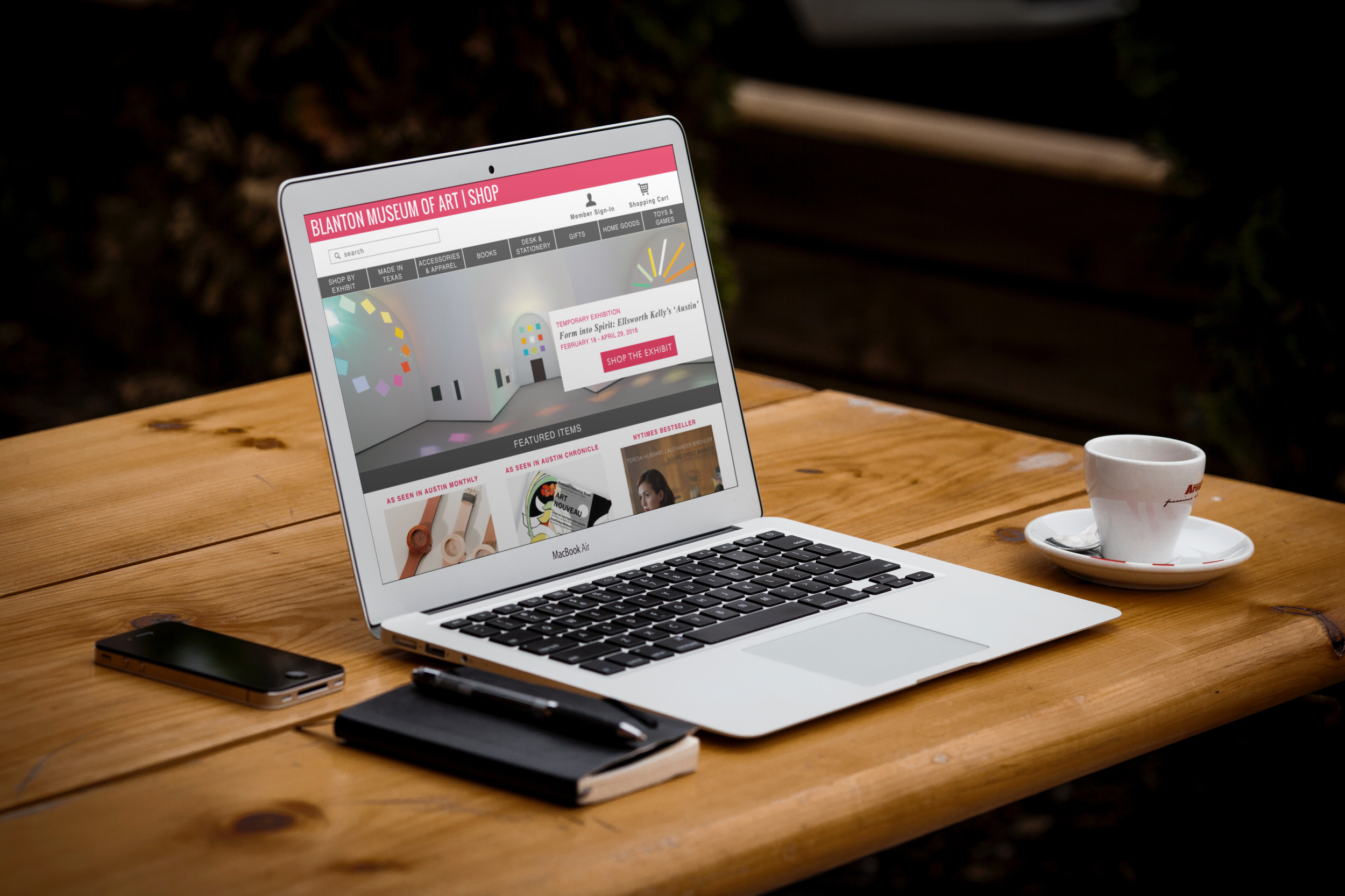
Design
After completing my research and creating personas, I moved into the design phase, which involved wireframing and building an interactive prototype of the site. I later added the Blanton's branding for my high-fidelity mockups.
Features
Based on my competitive analysis and interview insights, I narrowed down my list of features for the site.
Two commonalities I found between my two personas were that they look for discounts when they are shopping and they like to see items in person before purchasing them. These two preferences, along with my other interview findings, informed my decisions regarding which features to include.
Price Filters
One commonality I found between my two personas is that they consider price when making a purchase from museum shops. I included a price filter feature to help shoppers narrow down results when browsing.
Promo codes and member discount
My interview participants also mentioned that they use promo codes when shopping online and that they like to use their member discount when they have a museum membership. I incorporated both discount elements in the process.
Reserve in Store Option
Another insight provided by the interviews was that people prefer to see items in person when shopping for gifts and unique pieces. With this preference in mind, I included a reserve in store option so customers can see an item before purchasing it.
Featured Products with Press Element
After learning that product advertisements in newspapers and magazines are an effective method for generating interest in museum shop items, I decided to include a featured items section containing products shown in these advertisements.
Responsive Design
Although the focus of this project was the website, I also designed for mobile to make the site responsive for different devices.
Testing
I conducted four user tests on my prototype, and overall, the consensus was that the process and the different pages seemed logical. The process was easy to follow because it mimicked other e-commerce sites, so the conventions were familiar to testers.
Still, there were a few areas where the testers struggled, mainly due to lack of communication from the system.
Test Findings

- Information architecture - Some items in the navigation bar were confusing; users did not know what Temporary Exhibits and Texas Local meant, and they assumed these sections were related to museum events and not shopping categories.
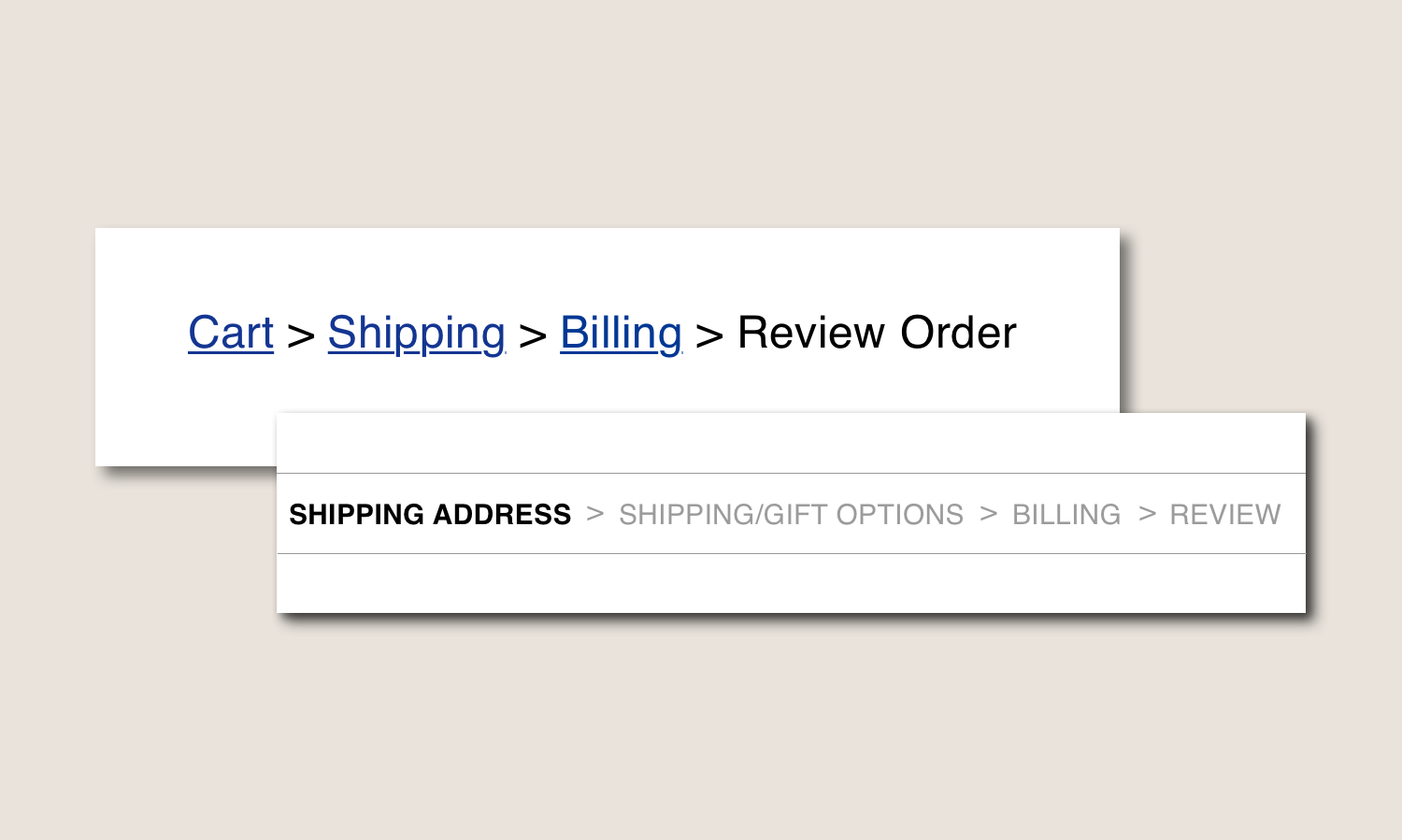
- Checkout progress tracking - Users would prefer a progress bar in the checkout, rather than breadcrumbs, because it would offer a forward and backward view of the process rather than providing only a retrospective view.
- Reserve in store feature - The reserve in store option left users with questions about whether their reservation was confirmed and when they would need to pay for the item.
Iterations
Based on my test findings, I made iterations to the pieces of my design that confused or frustrated multiple testers.
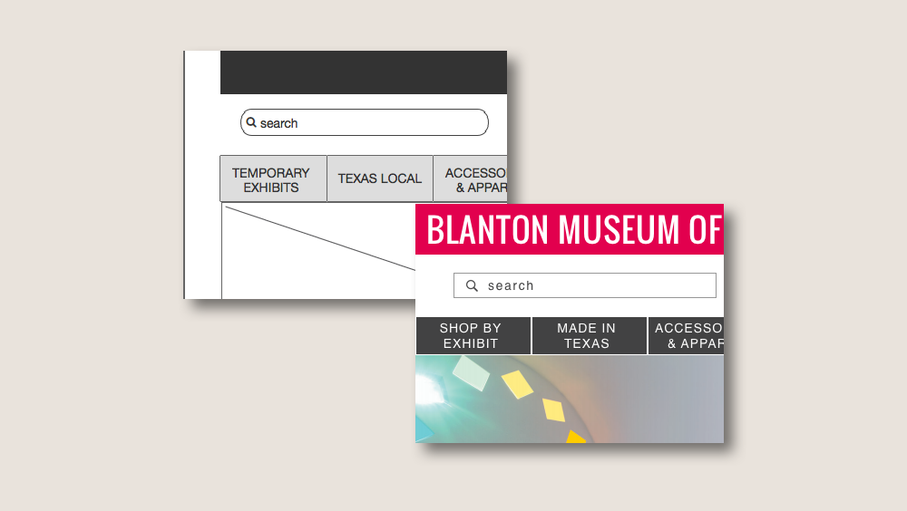
Information Architecture
I changed the wording for my temporary exhibit and local items sections so that they could be more understandable to the user. "Temporary Exhibits" became "Shop by Exhibit," and "Texas Local" became "Made in Texas."
Checkout Progress Bar
I removed the breadcrumbs in the checkout process and replaced them with a progress bar that shows the completed, current, and future steps on all checkout screens.
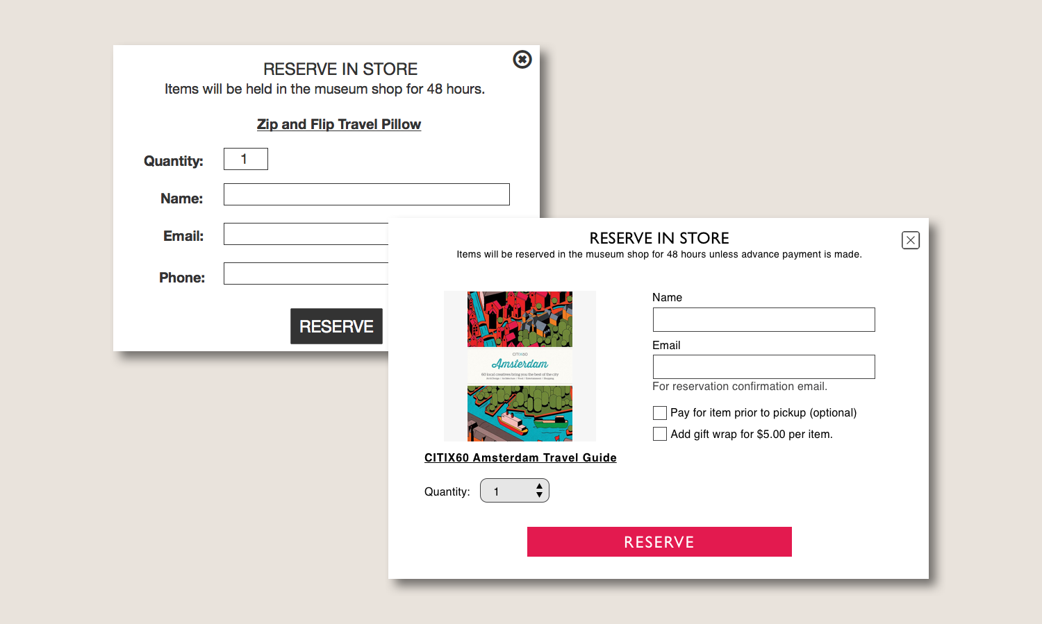
Reserve in Store
I added elements, such as an item photo and text that explains the reservation and payment options, to make the reserve in store option more understandable and communicative. Users now have the option to pay in advance of picking up their item.
Reflection
With the insights provided from my user tests, I iterated on my prototype and high fidelity mockups. The final prototype functions much better than the initial version, and it offers more communication with users so that they can be aware of all steps in the process and make more informed decisions. The user tests offered a great deal of insight about how people interact with my system and provided feedback and results that I would not have been aware of without seeing the site from a different perspective. With these findings, I was able to develop the site into a thorough and seamless system.
