
Overview
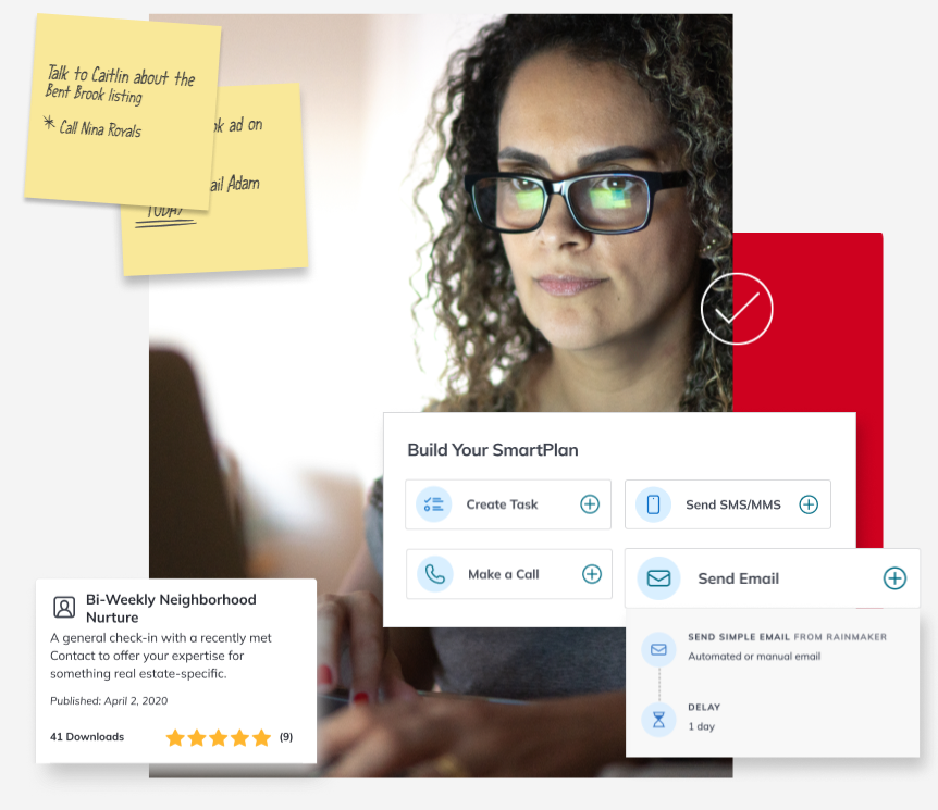
This project was a significant part of my work on Command, Keller Williams' CRM platform for real estate agents. As the lead designer for SmartPlans, a powerful workflow automation tool with a user base of 45,000+ weekly users, I focused on enhancing the SmartPlan building and management experience.
Workflow automation plays a pivotal role in lead generation and nurturing for real estate agents. Given that leads are a driving force of an agent's business growth, the real estate industry has a strong emphasis on "speed to lead." SmartPlans saves agents time in initiating their first touchpoint with potential clients and helps them sustain strong relationships with contacts.
The Problem
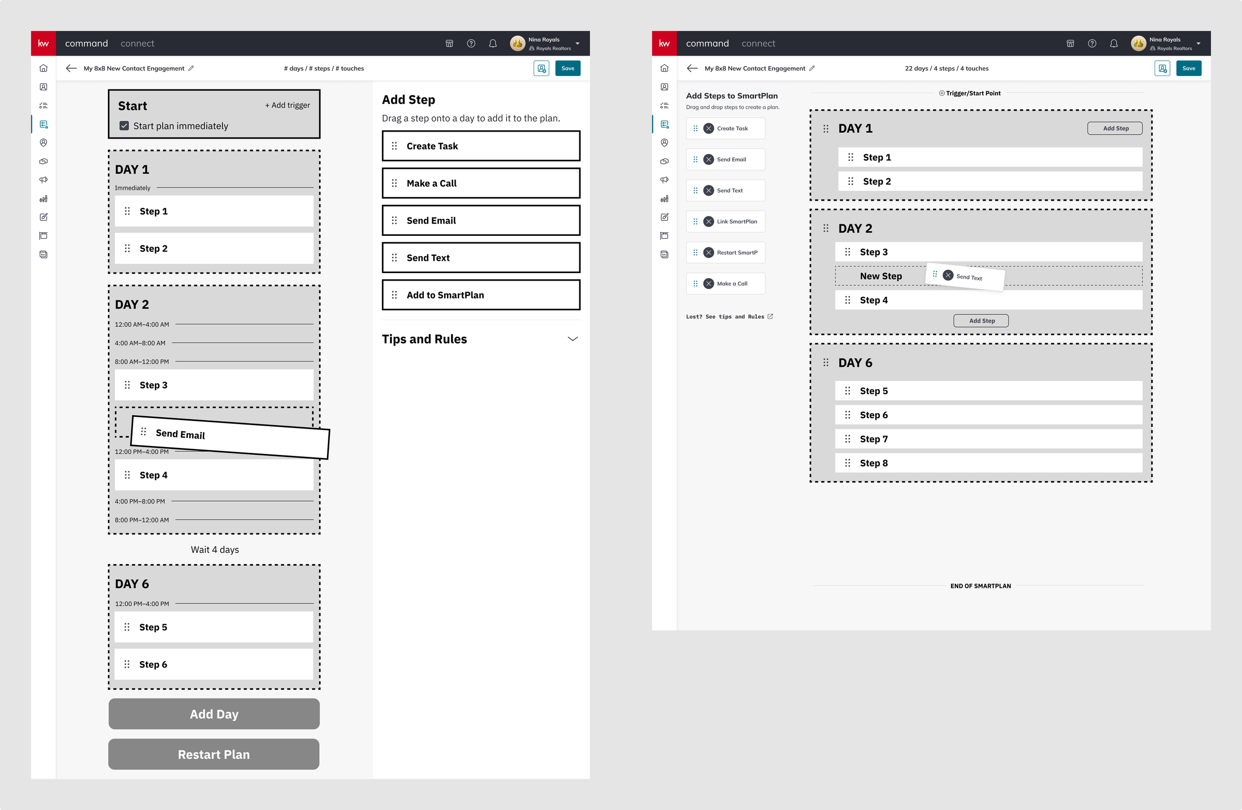
While SmartPlans already automated communication effectively, users often found the interface confusing, leading them to use standard templates rather than building custom plans. However, agents value the ability to personalize communications, adding a human touch to their interactions. It was clear that agents would benefit from using SmartPlans to its full potential, but there was a steep learning curve.
With SmartPlans as it was, agents faced challenges with limited control over the timing of communications—the previous backend of SmartPlans organized communications into a queue and sent them based on fixed 24-hour delays. Additionally, all plans adhered to texting rules specific to US Central Time, which was problematic for an international company like KW. The lack of control over timing sometimes hurt agent relationships with their contacts because it reduced the feeling that there was a human on the other side of an interaction.
My Role and Goals
As the lead designer on this project, my primary objectives were to enhance the interface to make it more intuitive and ensure that it followed KW’s design system, while giving users greater control over the timing of their communications. To address these challenges, the product team planned to introduce new features, including individual timing for each communication and a time zone setting, aligning more appropriately with KW's global presence.
Discovery
Evaluating the Interface
Having worked on SmartPlans for a couple of years already, I was familiar with the tool’s interface and had gathered valuable feedback from users regarding common issues they faced. Still, recognizing the need for a complete UI overhaul, I took this opportunity to conduct an in-depth evaluation of the tool's design.
To ensure a holistic approach and to gauge the scope of the redesign, I created a sitemap to identify all the areas within the Command platform where SmartPlans appeared. This allowed me to anticipate potential design work and ensured that nothing was overlooked.
User Research
In the initial stages of the project, I collaborated with the SmartPlans Product Specialist, employing various research methods to gain insights.
Part of the survey we sent to agents
Surveys
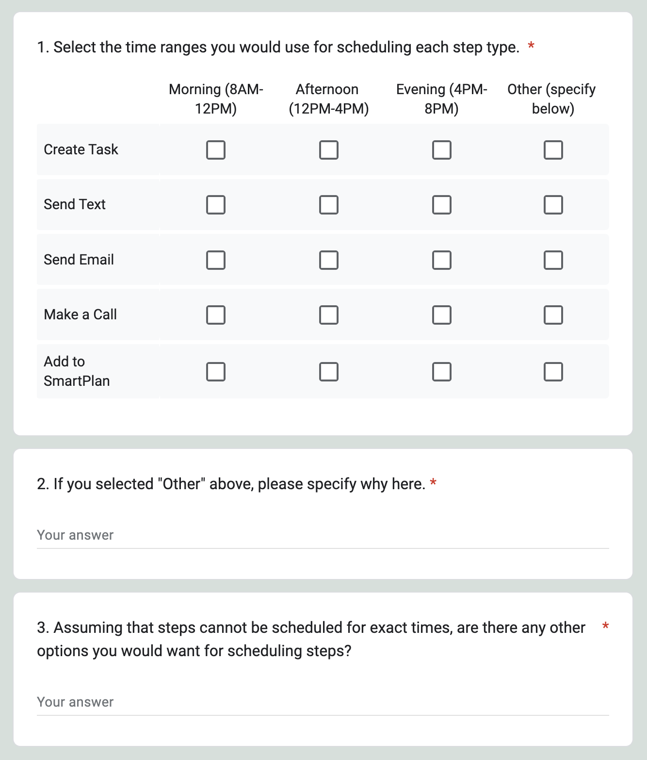
To get quick feedback from a large group, we sent a survey to agents asking about their expectations regarding communication timing control and the number of time zones they needed to support.
Labs
In addition to the survey, we conducted exploratory focus groups, known at KW as “Labs,” to have a deeper discussion about users' needs and experiences with SmartPlans. To ensure that we accounted for diverse perspectives, we conducted sessions with both our standard Labs participants based in North America and with our Worldwide Labs group.
Synthesis & Insights
I worked with the Product Specialist to synthesize our findings from the survey results and our Lab notes.
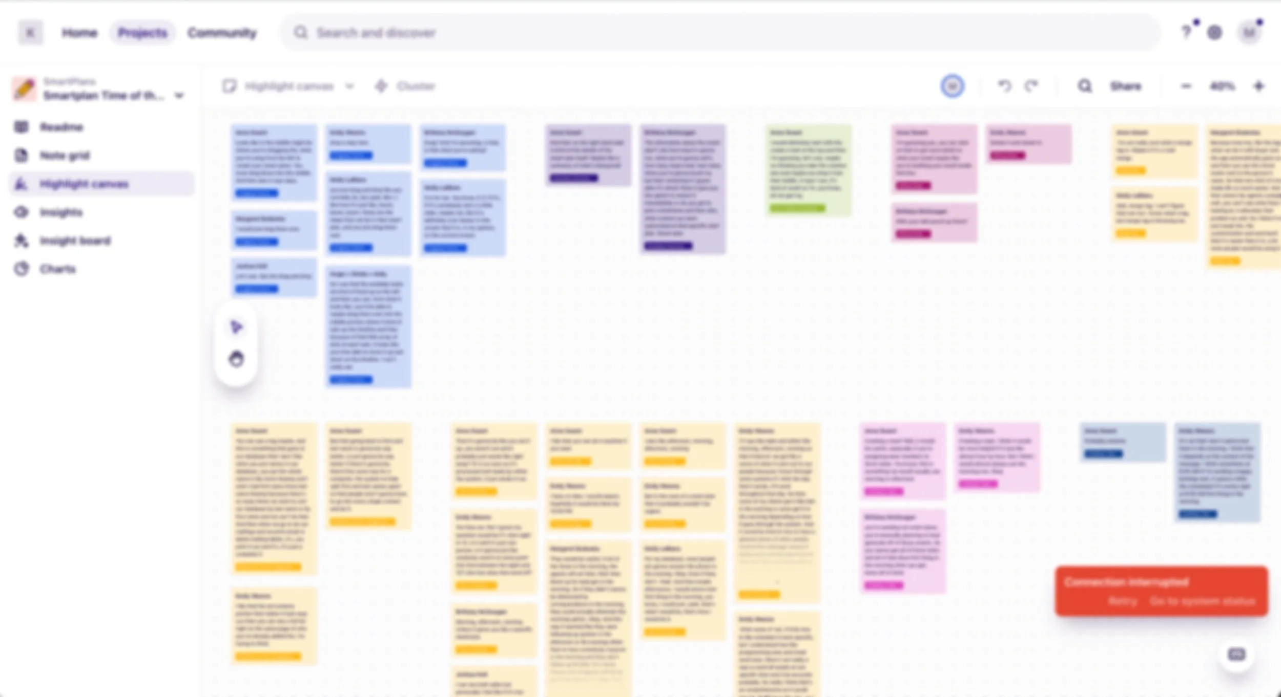
Synthesized notes in Dovetail
We then compiled our top insights into a presentation to share with the product team and other business and tech stakeholders.
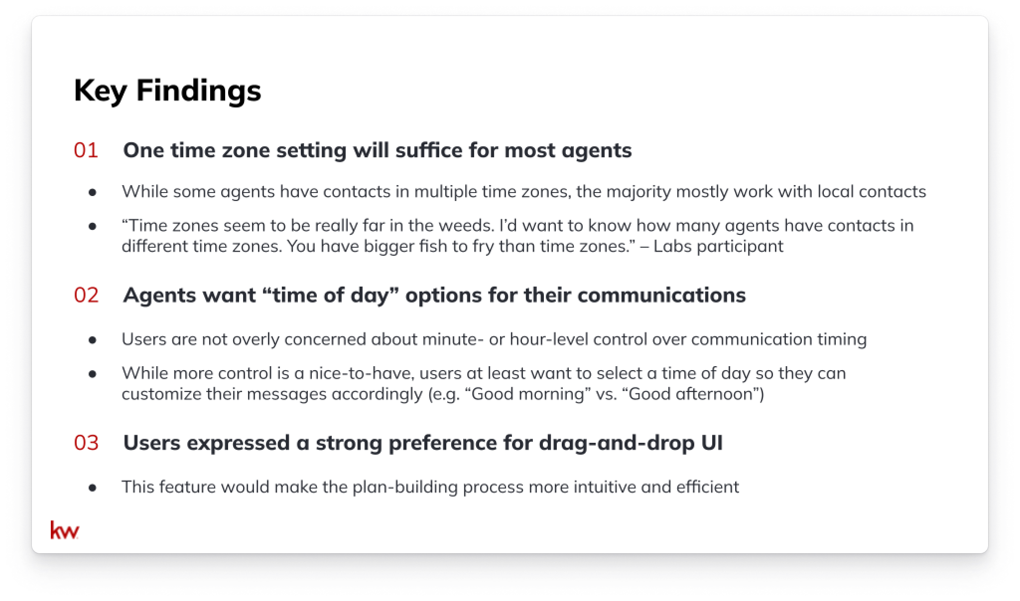
Research key findings
Competitive Analysis
As part of the research process, I conducted a comprehensive competitive analysis, examining both real estate industry competitors and leaders in workflow automation. By studying these products, I sought to understand the time control options they offered and to identify effective UI patterns, particularly drag-and-drop patterns.
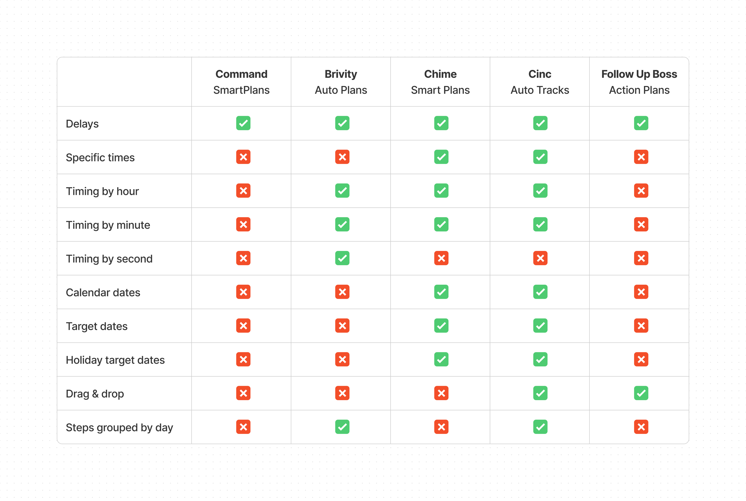
I compared SmartPlans to other workflow automation tools within real estate products.
Design
Early Concepts
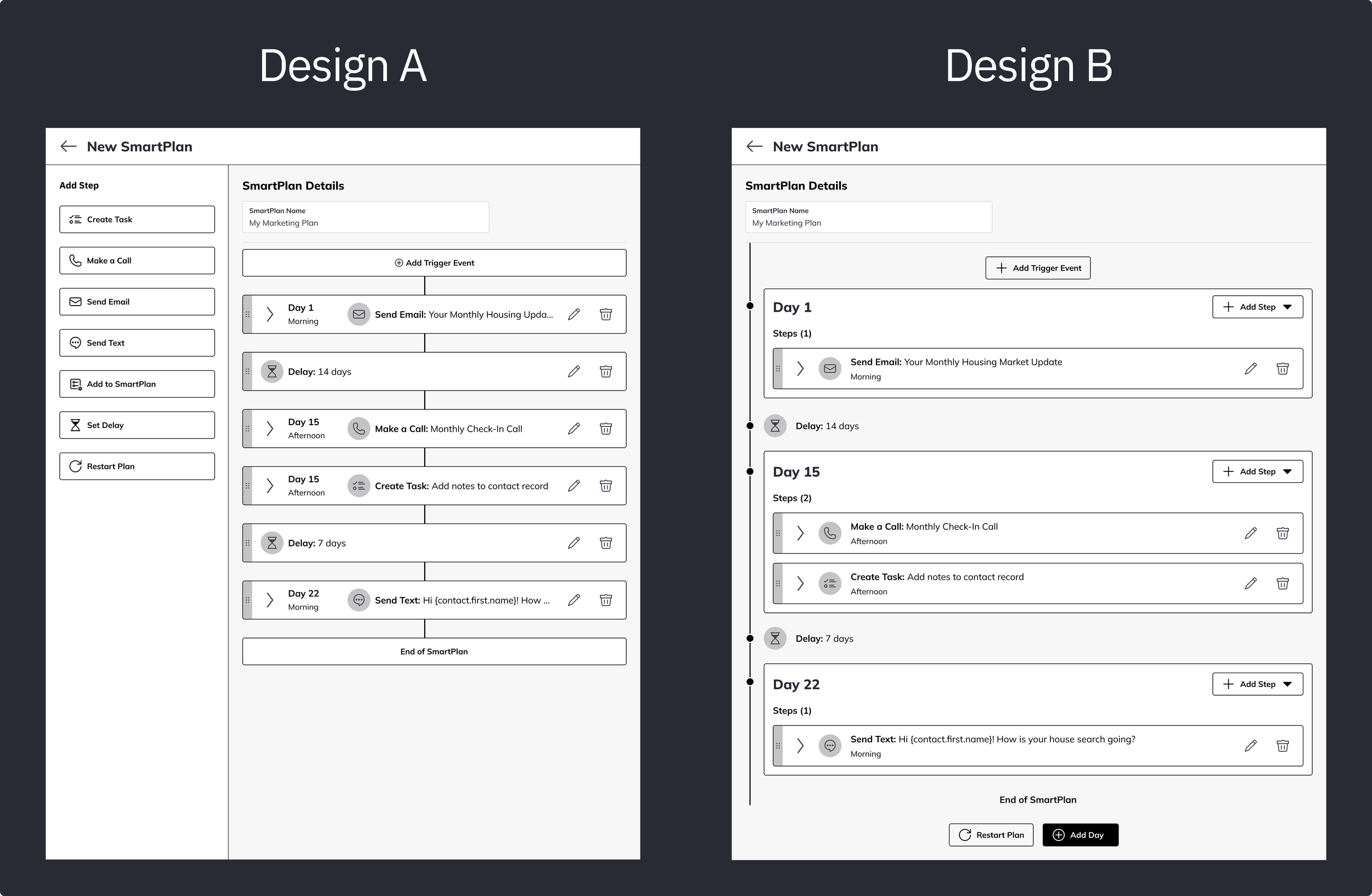
I created early concepts of what the new interface with time zone settings, time-based steps, and drag-and-drop interactions might look like. I thought of different approaches to delivering these features and created wireframes to compare concepts. Over a few months, we held a number of design evaluation Labs in which we conducted A/B comparisons.
I took the insights from these Labs to iterate on the designs.
Constraints & Considerations
During this project, I encountered several constraints that required careful consideration. By participating in weekly 3-legged stool (product, engineering, and design) meetings and other meetings with stakeholders, I was able to check in with my product team frequently to discuss constraints, anticipate potential issues, and adjust my designs as needed.
Engineering Limitations
I collaborated closely with engineering to determine how we could feasibly deliver new time control features. Given the need to support thousands of agents’ SmartPlans on the backend, achieving minute- or even hour-level timing control posed significant difficulties. However, based on insights gained from user research, we learned that users didn't necessarily require such granular control. Therefore, we decided to offer timing options in 4-hour blocks for the MVP. This approach would meet user needs without overloading the system.
Another critical engineering consideration was transitioning existing SmartPlans from the legacy format, in which step timing was not specified, to the new time-based format. To address this, we introduced a step time option called "Any Time.” The addition of this option would allow existing SmartPlans to continue running seamlessly, while migrating to the new interface.
I explored and tested a few options for migrating legacy plans to the time-based system.
Business Rules
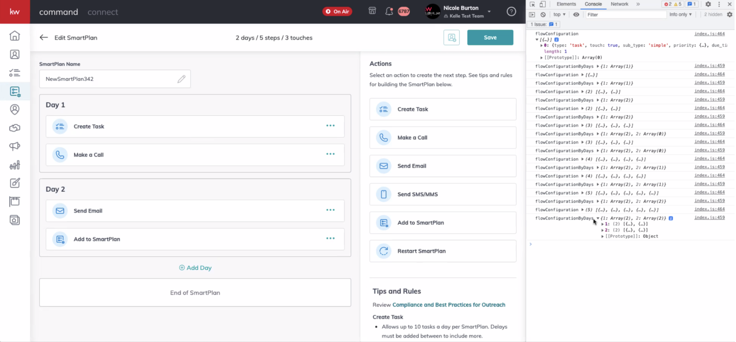
To further ensure that agents follow communication best practices, SmartPlans has established certain rules and error validations to prevent users from inundating their contacts with messages. These regulatory measures were a guiding principle throughout my design process. I aimed to quickly and clearly flag errors as users made them, making the experience more informative than it previously had been.
Previously, users became aware of errors only after saving changes to the plan. Because error messages only appeared in a modal, users were left to identify the steps that needed to be corrected on their own.
In the updated UI, I designed for inline error validation that makes users aware of broken rules as they build the plan and indicates where the errors occurred.
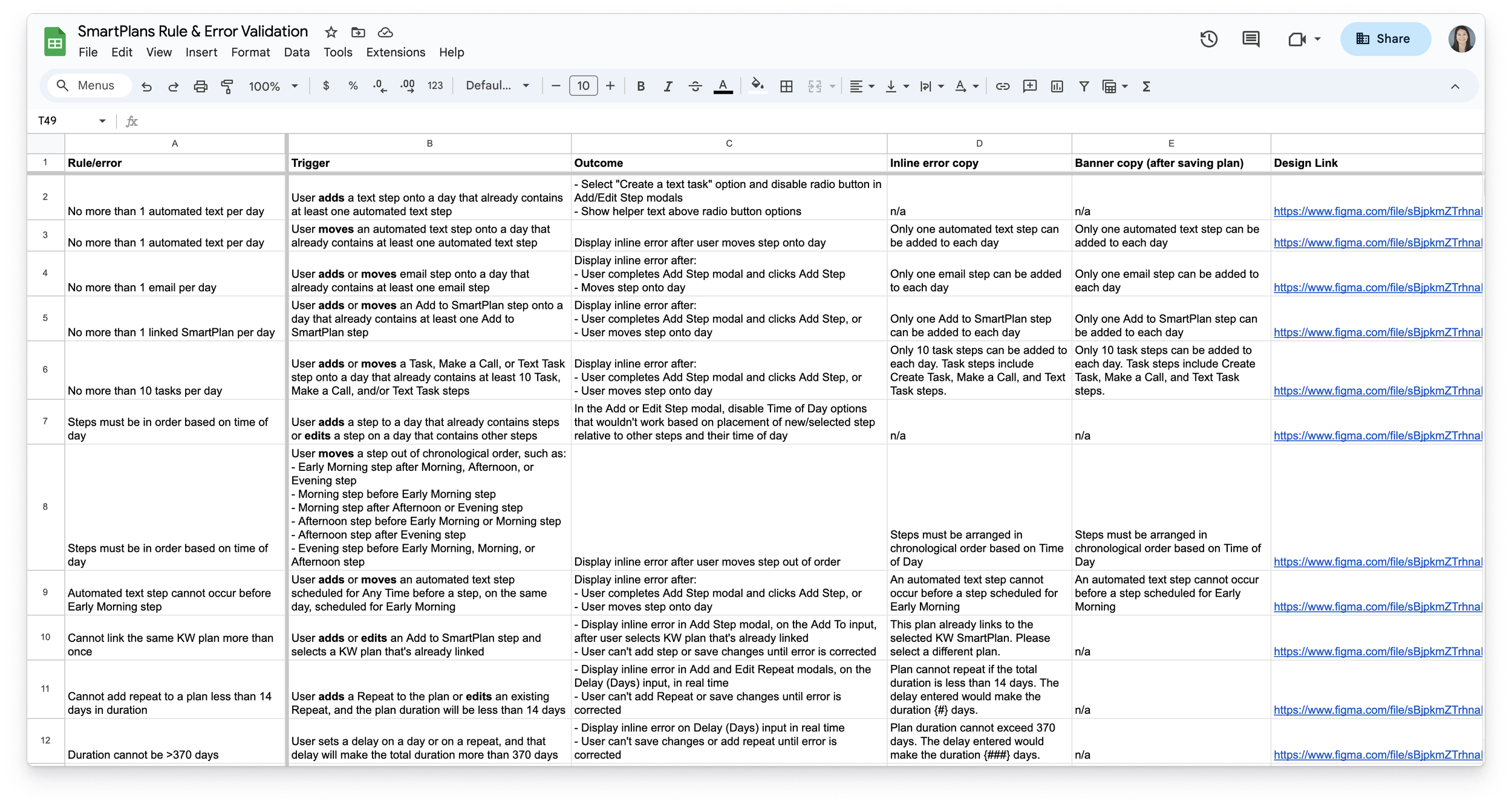
I compiled all error instances and validation messages in a spreadsheet for handoff to Engineering.
Legal Guidance
Offering an automated communication platform opens KW up to legal risks related to the Telephone Consumer Protection Act (TCPA). Consequently, our Legal team had a strong interest in providing guardrails to help agents comply with consumer laws. SmartPlans was particularly at risk of violating the TCPA because the tool didn’t support time zones beyond Central Time. This limitation exposed agents to the risk of unintentionally breaching call/text time limitations when reaching out to contacts living in any other time zone. The PM and I consulted with Legal about how to keep KW protected while meeting users’ needs and educating users about relevant laws.
Testing & Iteration
Because this project involved a complete redesign of the SmartPlans UI, it was critical to put the designs through usability testing. By properly testing the designs, we could ensure a successful launch of the new interface and have confidence in its usability. I worked with a UX Researcher to draft a discussion guide, and I created an interactive prototype that aligned with the user tasks in the discussion guide.
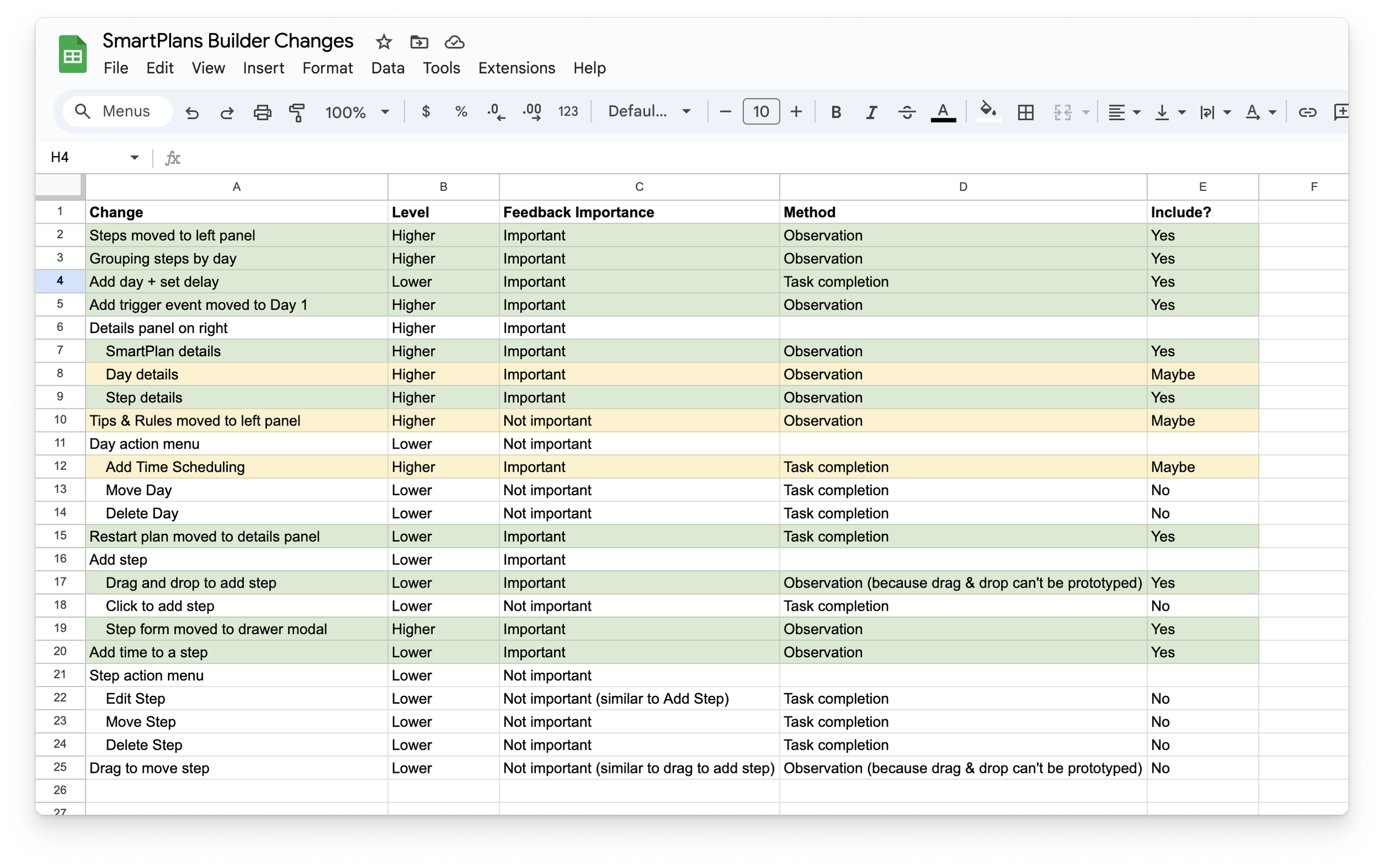
The redesign included a lot of changes, so I prioritized the most important user flows to include in testing.
The Researcher and I worked together to facilitate nine usability tests. Through these tests, participants completed tasks to build a time-based SmartPlans as they interacted with various parts of the new interface.
Facilitating usability tests
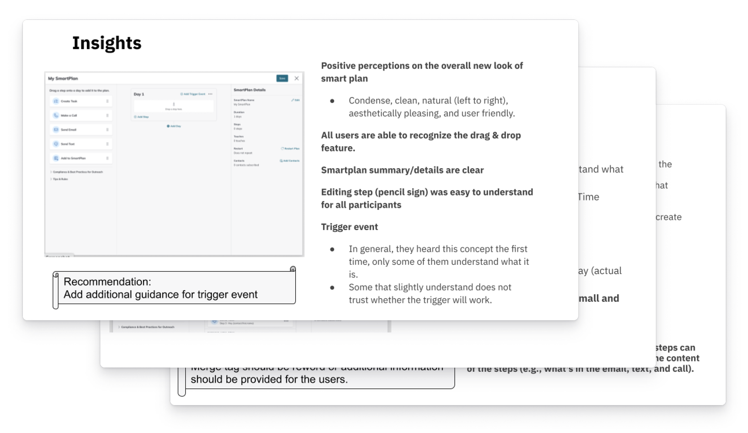
Users were largely able to complete tasks successfully. However, the areas where users encountered difficulties or confusion helped to inform subsequent iterations of the designs. This iterative approach enabled us to refine the UI even further, ensuring a user-centric and functional final product.
Slides from a deck that the Researcher shared
Design Reviews
I place significant emphasis on the value of design critiques and discussions with my fellow design colleagues. This approach ensures that my designs align with the rest of the platform. It also helps me think of creative solutions when I run into challenges or when I need to adapt the design system to support my designs. Throughout my process, I frequently met with our Design System Manager during designated office hours to ideate and refine my designs. I also shared my work during daily check-ins with other Command designers and weekly design jams with the entire design team. I appreciated the opportunities for mentorship and collaboration that these sessions offered me.
Wireframes from office hours and jam sessions with other designers
I also shared my designs with KW’s tech leadership during stakeholder meetings, which involved presenting polished prototypes and effectively telling a story.
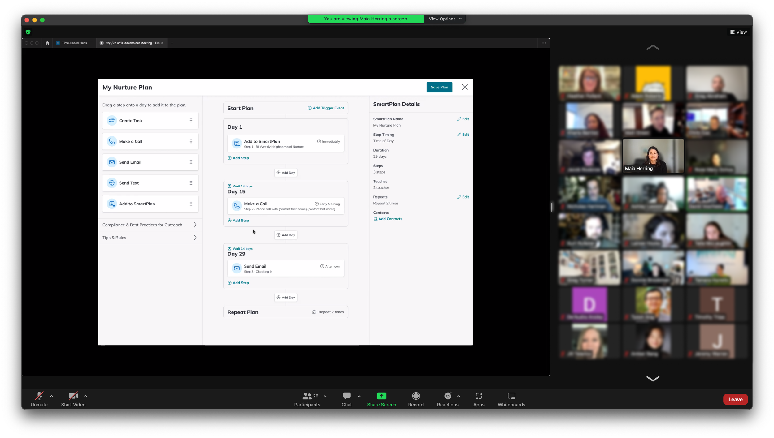
Presenting a prototype at a stakeholder meeting
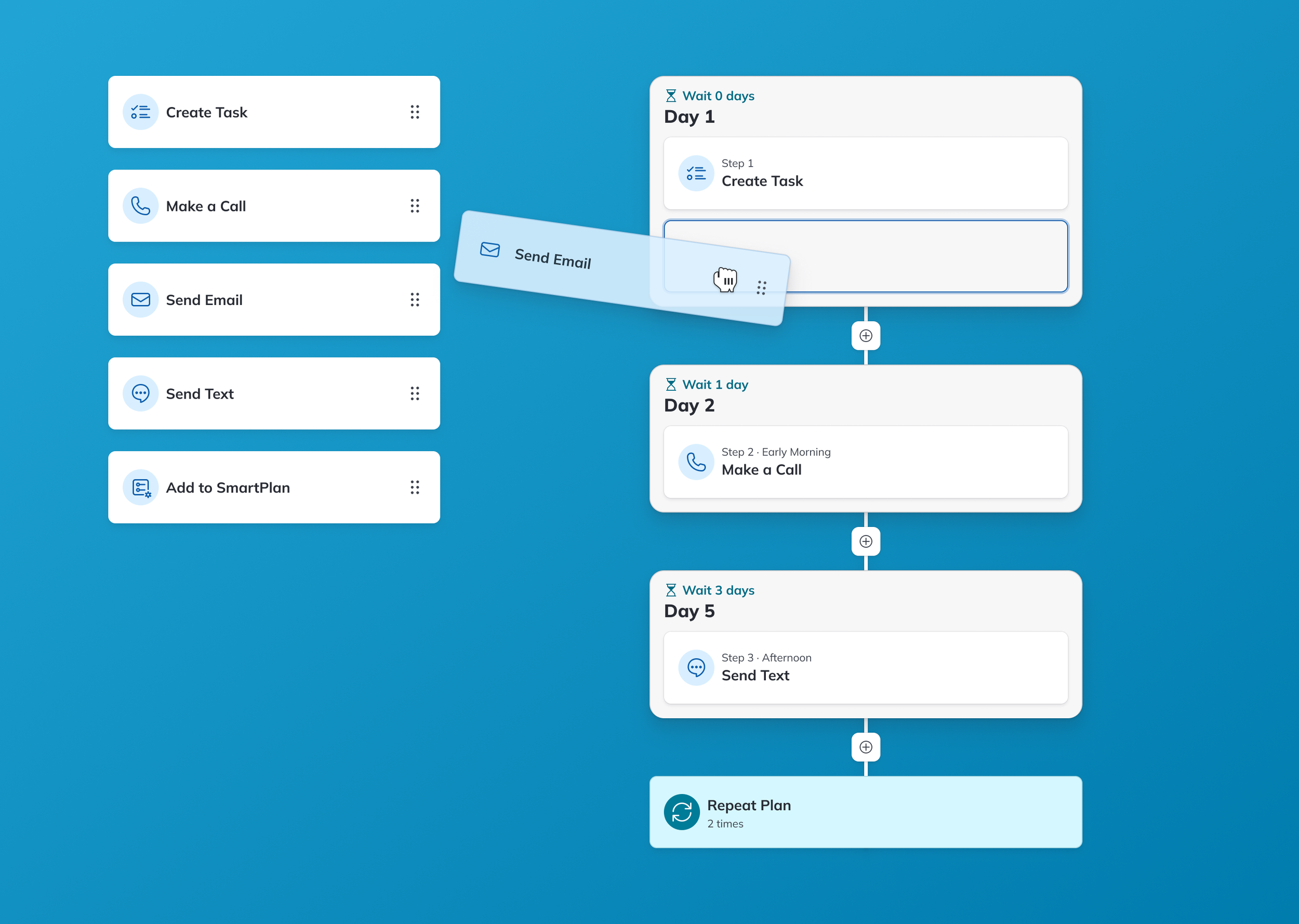
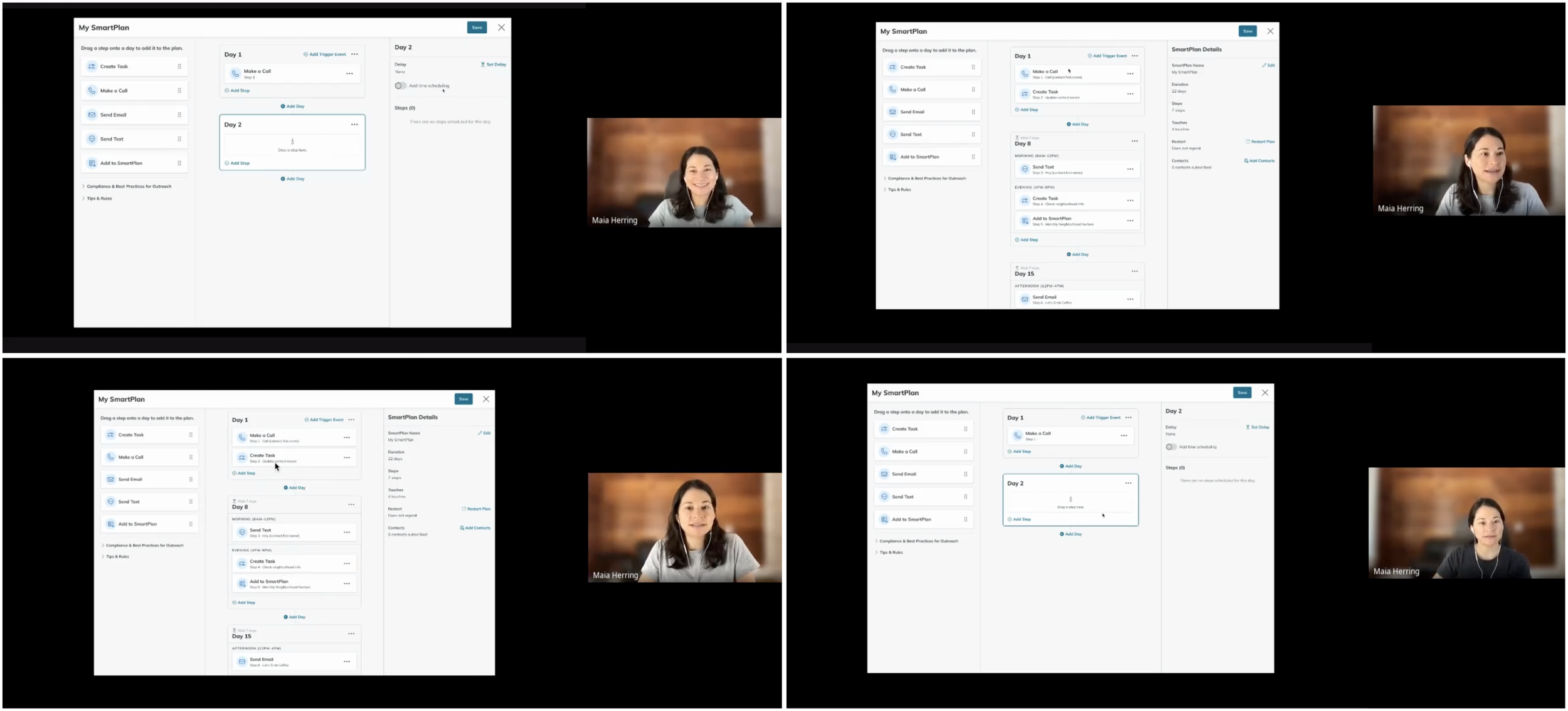
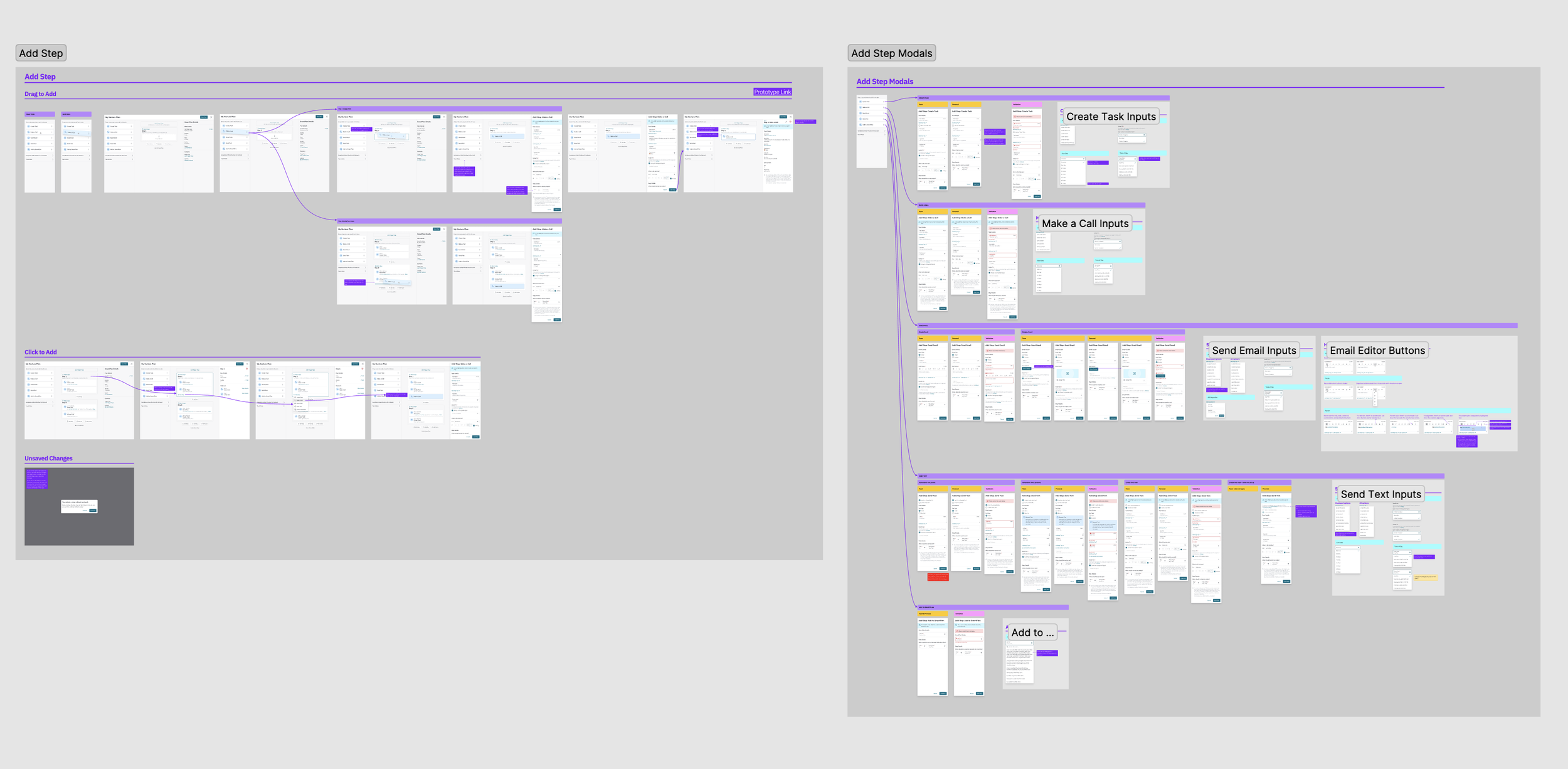
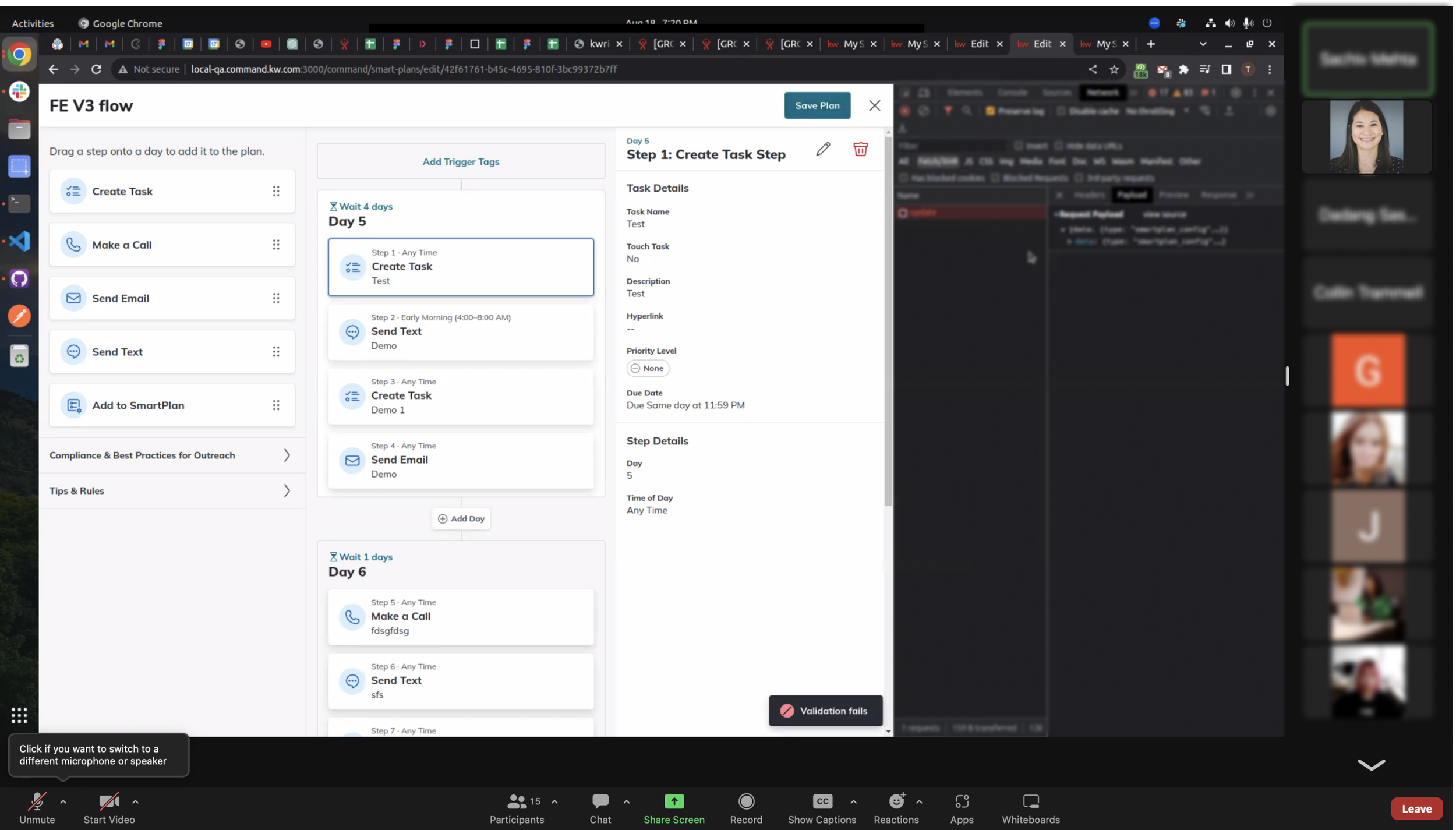
The interactive prototype shows how to add steps and days to the SmartPlan and how to repeat the steps
Responsive Design
A fun and challenging part of this project was creating responsive designs. Although these designs were not designated as high-priority, I wanted to create them, even if they would end up in the backlog. During Labs, several users had shared that they often access Command from tablets and mobile devices. Furthermore, our Data team had collected analytics that showed that a large portion of users work in Command on smaller screens, so I wanted to support the small screen experience. I worked with the Design System Manager and Command Mobile app designers on these mockups, and I’m proud of how they turned out, despite the challenges of making a three-column design work for smaller screens.
Delivery
Handoff & Implementation
My collaboration with Front-End Engineers was fundamental to the project. During weekly check-ins, I shared my work in progress and discussed how I intended for the user flows to work. These discussions served as an opportunity to clarify the intended behavior of components. Weekly meetings also gave engineers an opportunity to provide insight into the feasibility of designs based on their technical capabilities.
Given that drag-and-drop was a new pattern for SmartPlans, our existing design system did not provide all the components that we needed. To address this, I worked closely with the Front-End Lead early in my process to communicate design concepts. The Lead then set out to identify a component library that could be leveraged to create a proof of concept.
Front-end proof of concept
After I delivered high-fidelity mockups and flows, I continued to meet with the product team weekly so that I could answer questions, make design adjustments, and address unforeseen edge cases brought up by Engineering and QA. I also attended bi-weekly demos to assess the front-end progress, ensuring that implementation aligned with the envisioned design.
Front-end implementation demo
Beta Testing
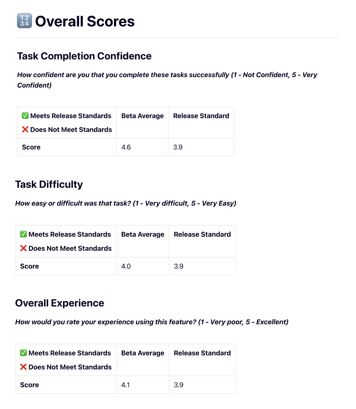
Before we released the new interface to GA, the Product Specialist conducted beta testing with 53 Labs Advisors and Regional Tech Trainers. Participants completed tasks that tested both the new UI and time-based functionality. Beta testing determined that the feature was ready for release, while revealing opportunities for us to further improve the product after release.
Post-Release Usability Testing
One month after the feature and UI improvements went live, the Product Specialist conducted one-on-one usability testing sessions with four Command users. For the most part, the Task Difficulty scores improved.
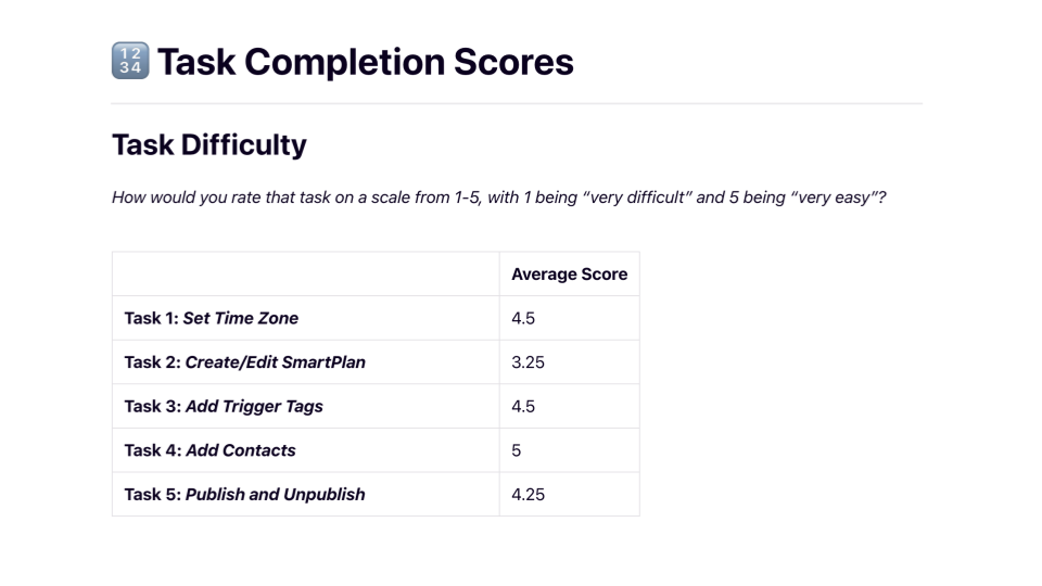
Some of the lower Task Difficulty scores revealed areas where we could offer more guidance and training to users, which is understandable, considering how much the UI changed for existing users. To better understand the effectiveness of the new design, I would recommend testing with first-time SmartPlans users as well. Still, through this process, I learned that a more incremental roll-out of UI changes could have been more effective for easing the transition.
Overall, participant feedback was very positive.
Reflection
To measure the success of the new interface and time control features, we will continue to track the SmartPlans’ overall happiness score (HEART metrics) and the number of new custom plans created. To develop the backend in an informed way, we will also monitor which times of day are most popular for sending communications. This information will help us to determine how we can support more specific time controls in the future.
As we continue to progress through our roadmap, we’ve also implemented the new interface and time controls within KW’s CommandMC platform. Now, KW’s Market Center leadership has access to the same SmartPlans features that were first introduced to agents.
Additionally, our next steps will include offering more date-based controls in SmartPlans, and I’ve already begun to explore and test designs for building calendar date functionality into the existing interface.
Heat maps from usability testing for date-based SmartPlans
This project was a major endeavor and took more than a year to roll out. Revamping the entire SmartPlans experience was a large undertaking, but I welcomed the chance to work through difficult challenges and develop my craft. Not many tech organizations are willing to invest time and resources into a complete product redesign, so I feel fortunate to have had the opportunity to improve the user experience from end to end.